FITNESS APP
UI Design
Role:
UI DesignerTools:
FigmaThe Problem Or Goal:
Some fitness app don't provide all the assistance that a health enthusiast needs. Fitness apps can sometimes provide nutritional information and a food diary, but doesn't help you with exercise and goals and some fitness apps helps you keep track of your exercise goals and routines, but don't provide nutritional information. This fitness app is here to solve that problem by being easy and intuitive to use and is also a one stop app for all your health needs.
Audience and Solution:
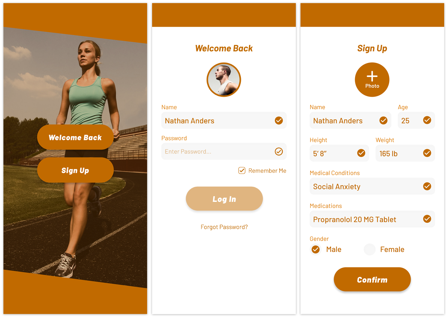
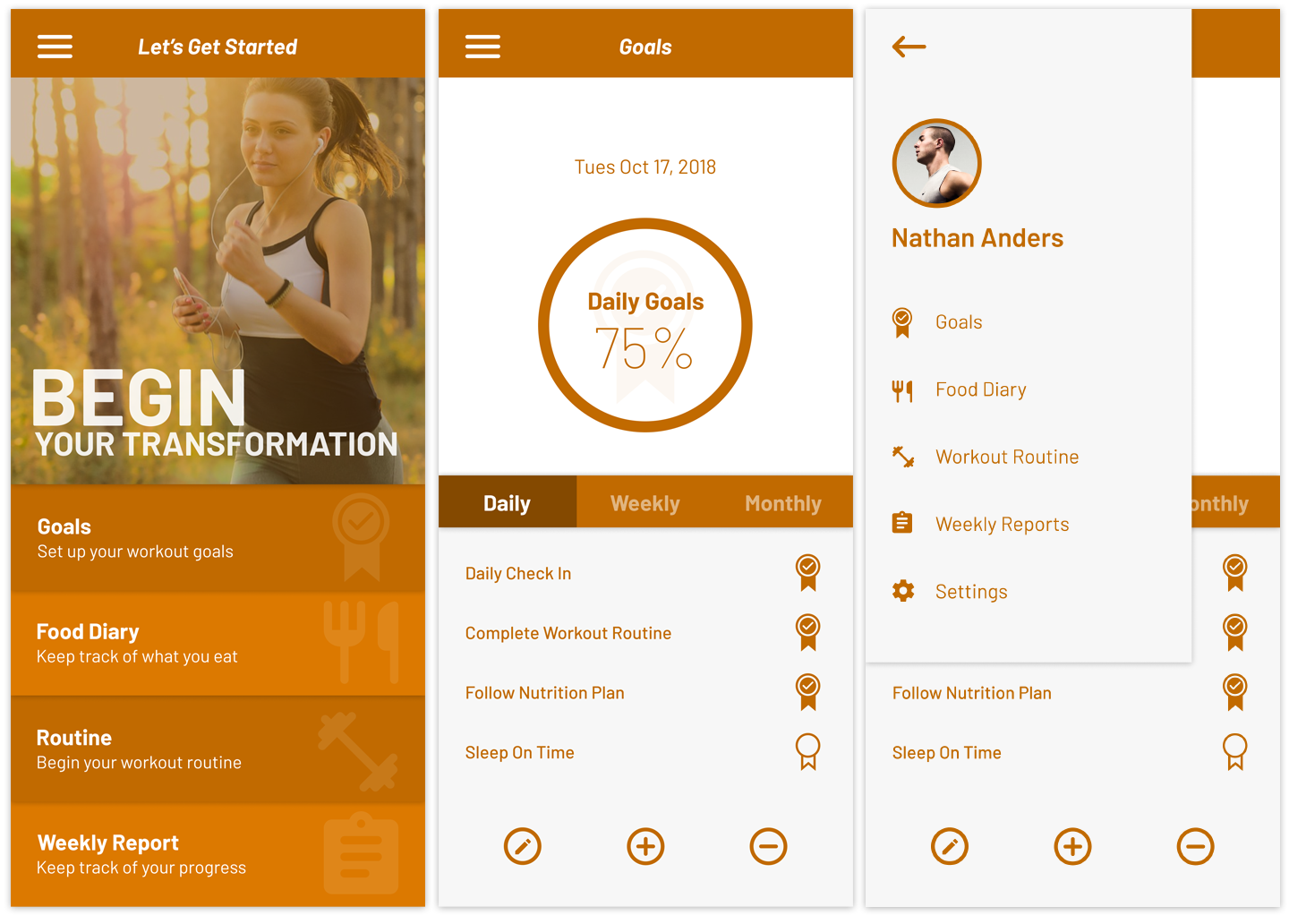
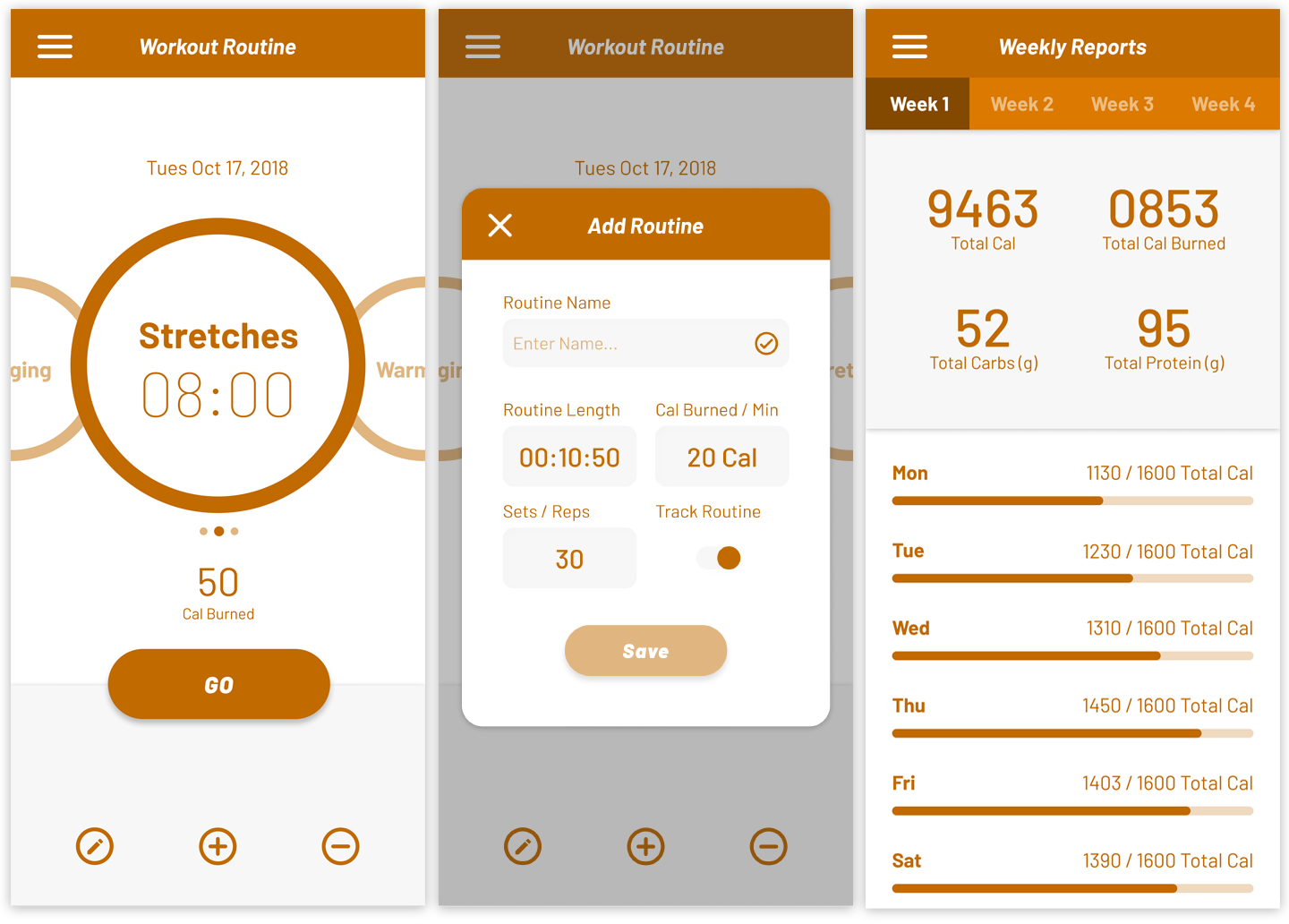
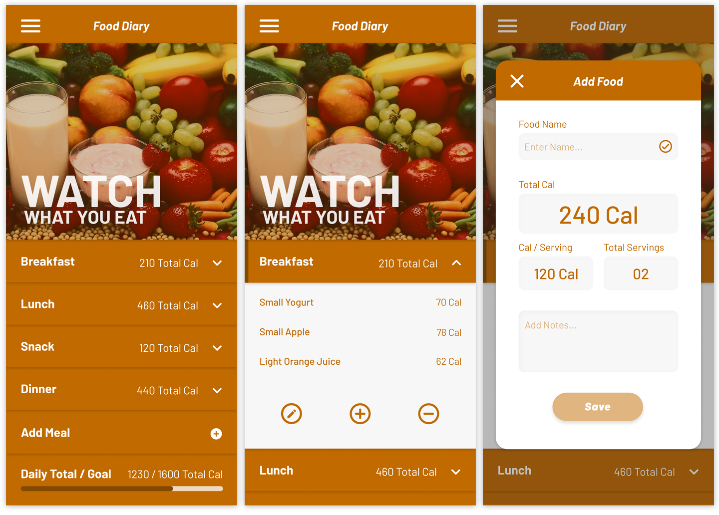
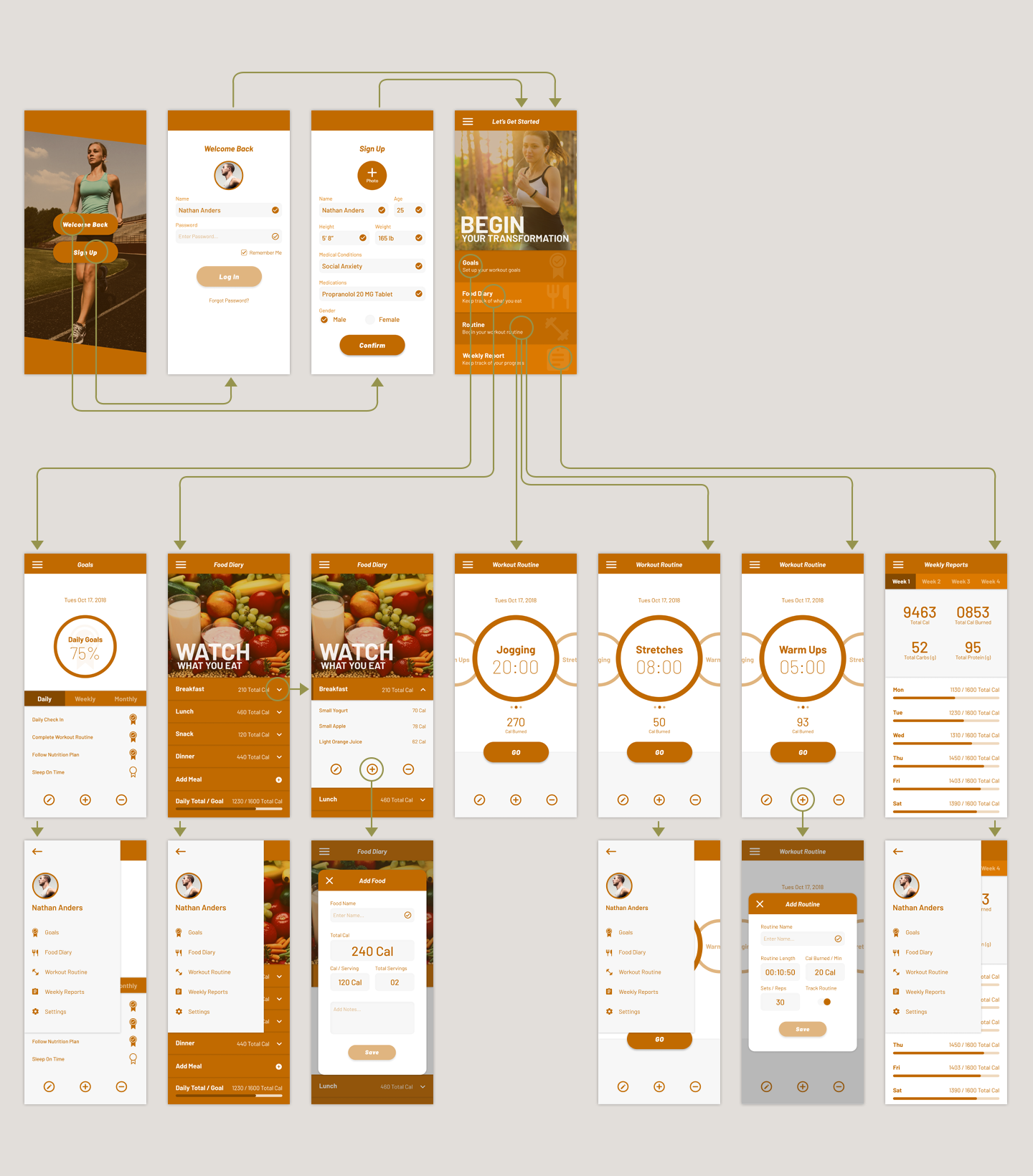
The target audience are health enthusiast that love to keep track of all aspect of their health from nutrition to their workout routines and also establish goals to work towards. The approach to this project was to create an app that provided everything health related that someone would need. Research and interviews with health enthusiast established that they want to have a food diary page that allows them to add and remove meals, a page to setup workout routines, a page to create goals to work towards and a statistical weekly report page to keep track of their calorie consumption so they can make adjustments.Notice some of the pages mimic an action or item in real life. The Workout Routine pages uses round shapes around the time to represent a watch and the Food Diary page contain hidden pages that slide out just like how you would flip through the pages of a real diary. By designing page interaction and aesthetic based off of other common real life actions and elements it makes it easier for people to familiarize themselves with how the app functions and looks.
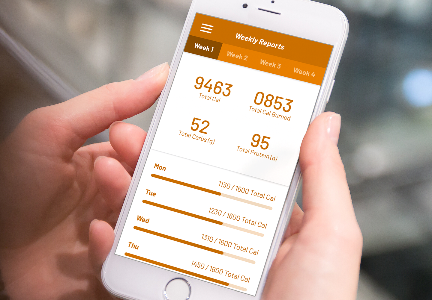
Weekly Report page contains progress bars for the week and the goal page contains medal graphics that provide userfeedback about which goal is complete and which is not. A white and orange color palette is also selected because orange represent energy and bright colors grab the user attention waking them up for their workout routine.
The Process:
Research is conducted to determine the goals of the fitness audience through surveys, creating user persona and finding out the company and product message. Wireframes are made to give a rough layout about where certain interactable elements are to be placed in the interface. User data such as vision hot spots which is about where the eyes of user are drawn to and also tactile hotspot where user frequently touch guide the UX designer in wireframe development.UX decisions such as making buttons for the work routine sections large and making the information font size large is based off the idea that the mind and eyes have a harder time focusing when things are moving. When you're working out you're constantly in motion so it was decided to make the buttons large to reduce frustrating in press it which is seen in the start and stop button for a workout routine. The same idea can be applied to having larger text that makes it easier to read when you're working out like running.
Once the wireframes are approved the next step is for the UI designer to create a mockup of the user interface using a prototyping program such as Sketch, Adobe XD or Figma. The UI designer utilizes typography, images, shapes and color to create emphasis and interest in the design. Once the mockup is complete it is reviewed and if approved it is then sent to a developer.
The developer creates a working version of the user interface which is then given to a test audience that will use the interface and record any problems that occur. A button might be too hidden for the user to notice or the user is frustrated about having to press too many button to complete their goal. All of this feedback gives the UI/UX designer guidance to revise the design. After final approval the design is release to the public and feedback from the public can mean more revisions and updates to the design.
Input Feedback:
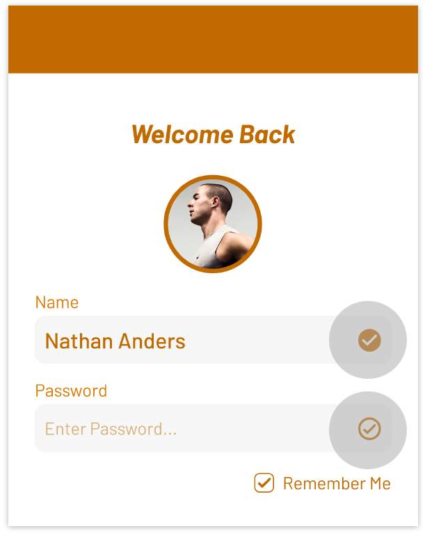
Using graphical elements as a way to alert the user that something is incomplete or needs attention is a key part of UI design. Element can appear transparent or hollow and users will psychologically interpret it as incomplete. In this UI design the top checkmark is filled and the bottom is not which indicates to the user what is completed and what isn’t.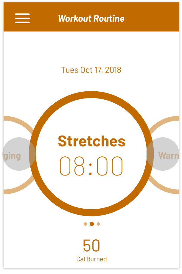
Swiping:
Swiping left or right to cycle through elements in an interface is second nature for users and is applied here as a way to switch between workout routines. Workout routines are teased in the background in a lower opacity compared to the main routine to indicate their hierarchy as secondary, but available to switch to by swiping left or right.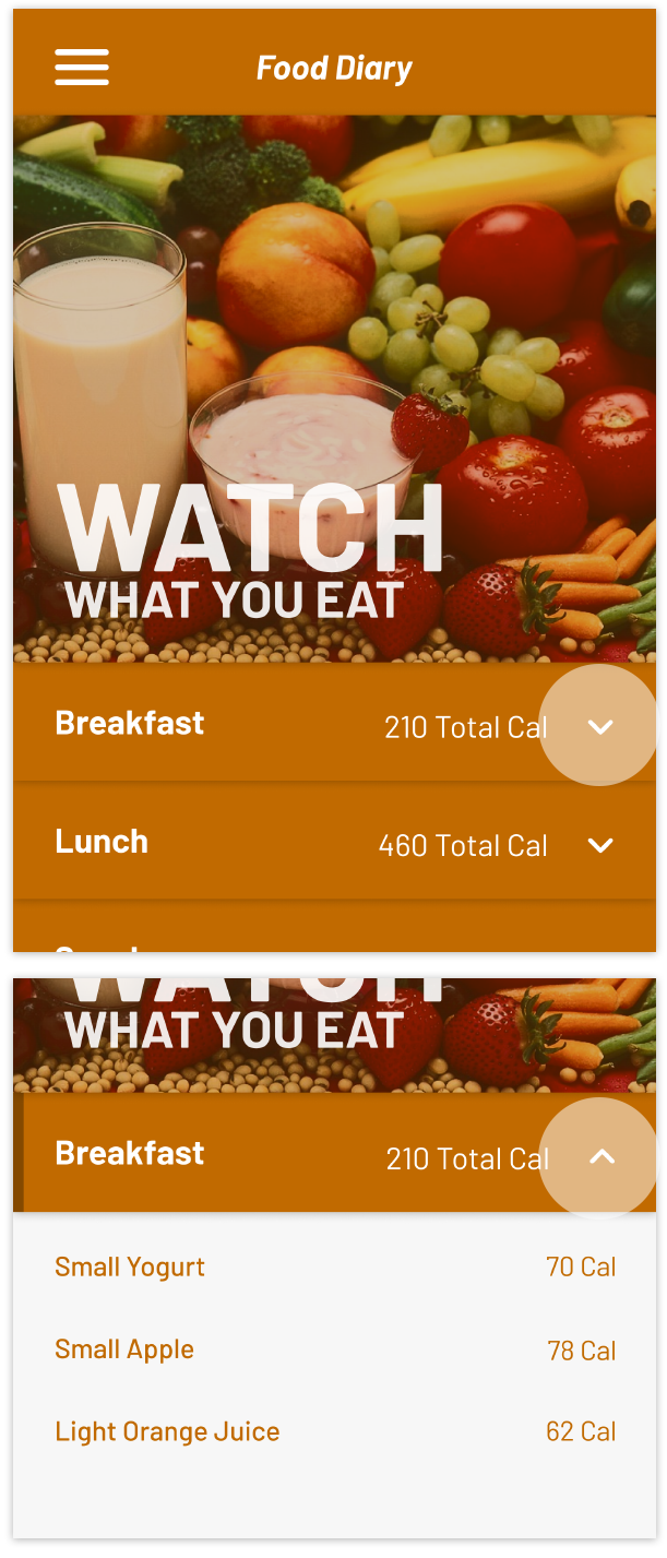
Collapsing Information:
Space is limited in UI design. A method to deal with this issue is to hide information under collapsing elements that can be interacted with. The graphic icon pointing downwards visually alerts to the user that they can tap it to reveal some more information.


Designed and Coded by Richard Lim