EXPRESS PACKAGING LOGISTICS (EPL)
UI Design

Role:
UI DesignerTools:
FigmaThe Problem Or Goal:
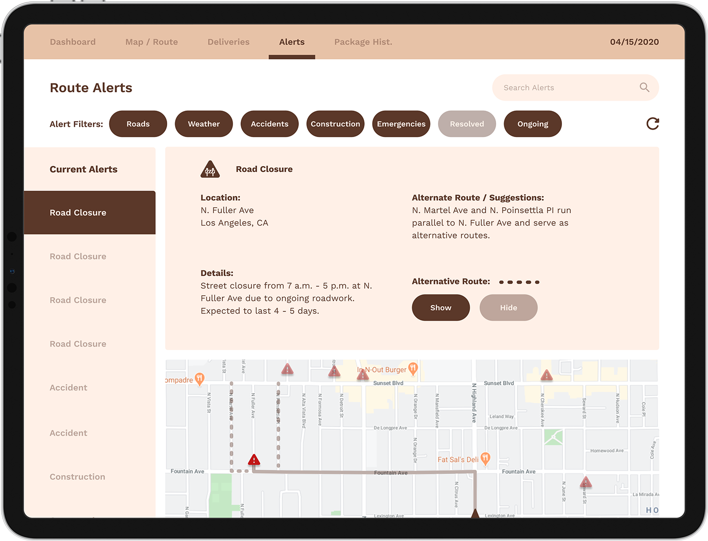
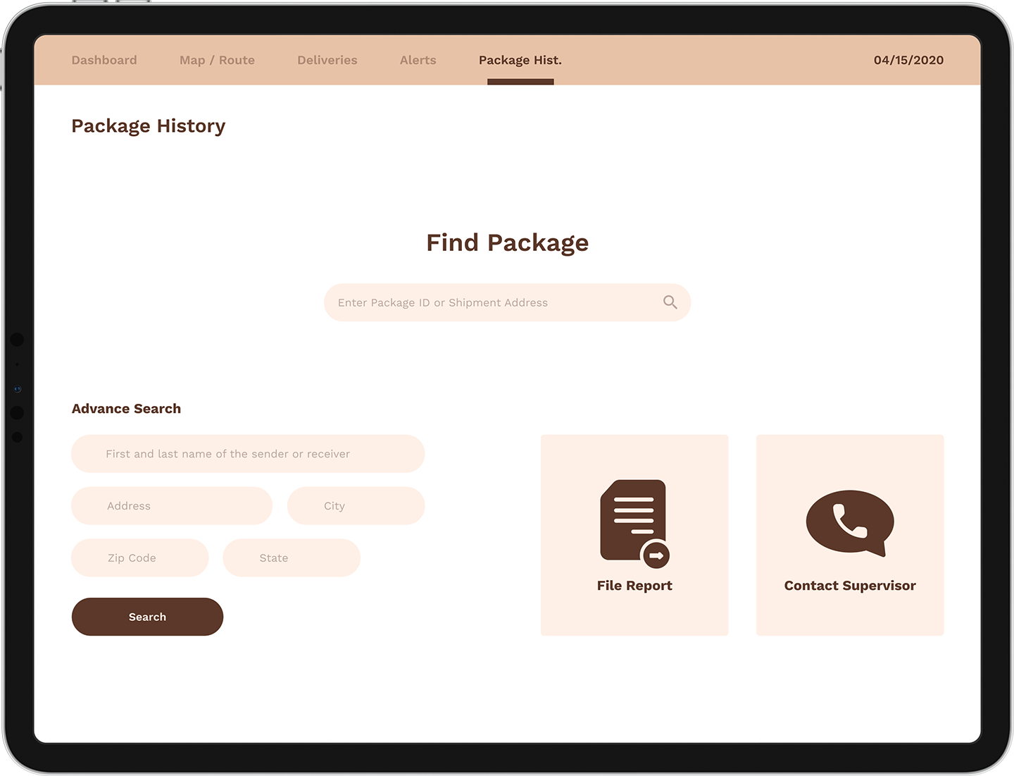
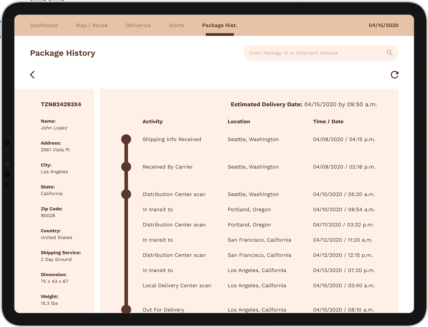
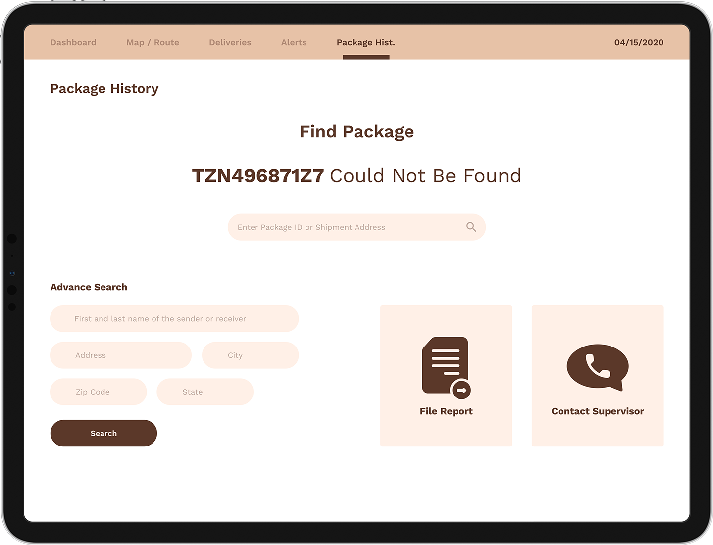
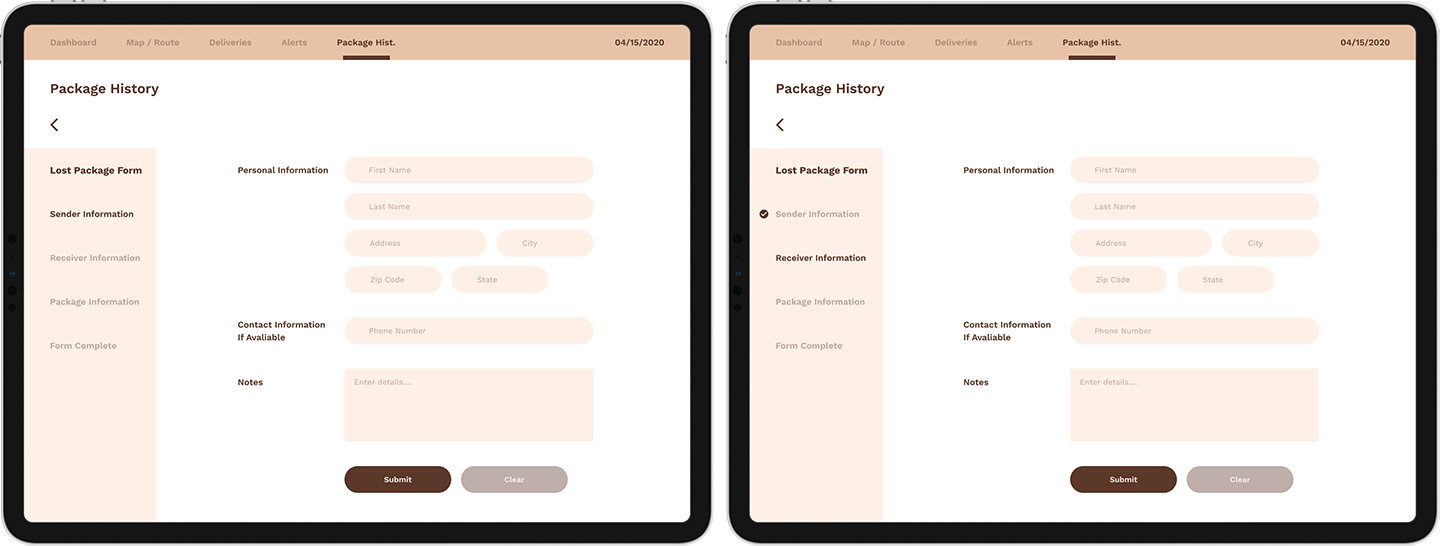
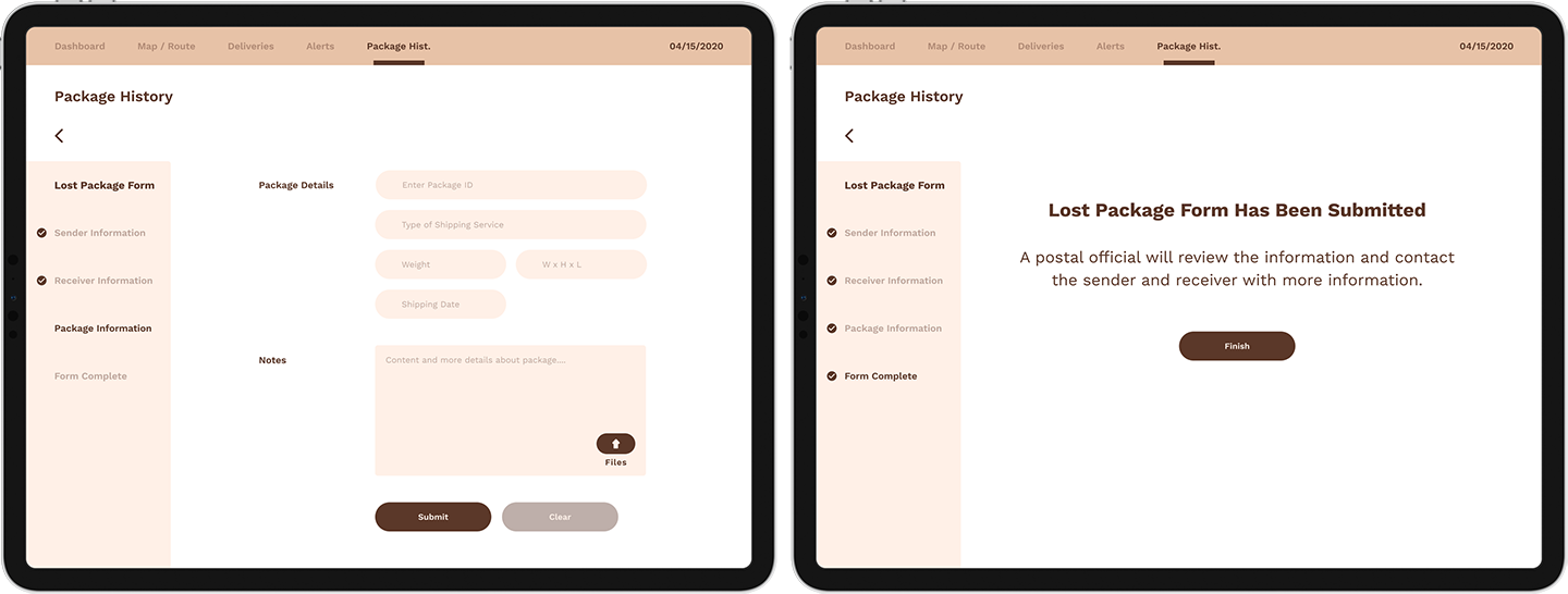
Technology is an important part of logistics and the systems in place have to constantly evolve to keep up with the current demands. Two of the current demands are faster service and accurate logistical information and this all begins with the employees. Express Packaging Logistics (EPL) is creating a unified and streamlined logistic tool for employees such as drivers and route delivery personnel. This tool will provide the field personnel access up to date information such as tracking, deliveries, claims and complaint support, alerts and GPS route information. This allows them to provide faster services through route planning and deliveries, streamlined package delivery confirmation and can also help file certain claims and complaints on the spot.Audience and Solution:
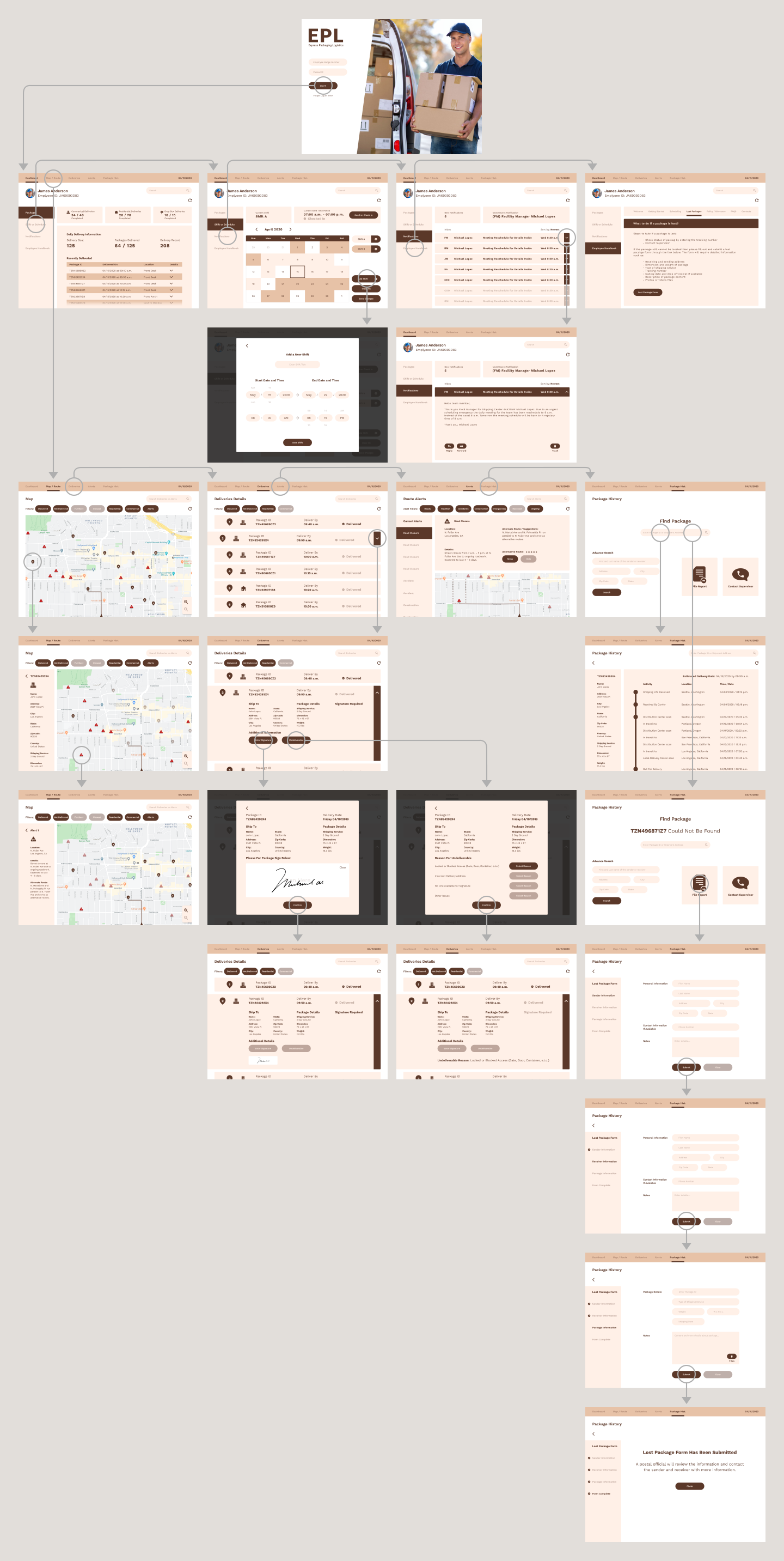
This design would be used by the employee that are constantly interacting with the packages so they are the audience. We interviewed the drivers that carry the packages, team members that work in the distribution centers and the delivery men and women and we ask them about their experiences with the way the current system functions and possible improvements. There's also a chance that this UI design could be converted into a design that would be used by customers through a couple of tweaks into the design that determines which section can and can't be access by customers.Having a unified interface in which almost everything to do with logistic can be done was one of the most suggested comments by the employee interview so the goal was to design an interface that combines all aspect of logistic such routes, communications, alerts, tracking and deliveries and filing compliants into one single tool. Instead of using your phone to coommunicate with management, having a separate GPS in your delivery vehicle and another tool to scan it all can be done with this design.
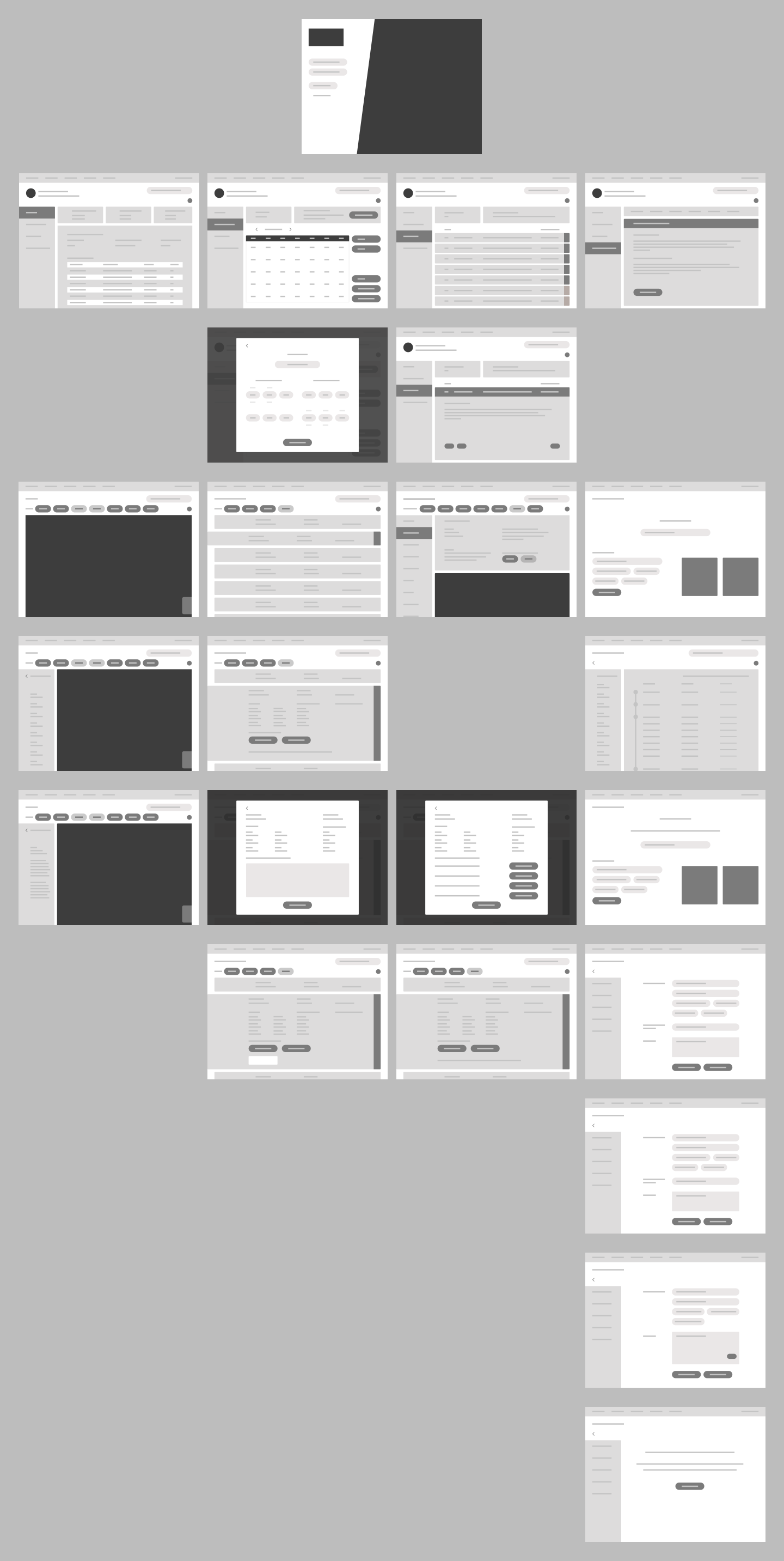
The Process:
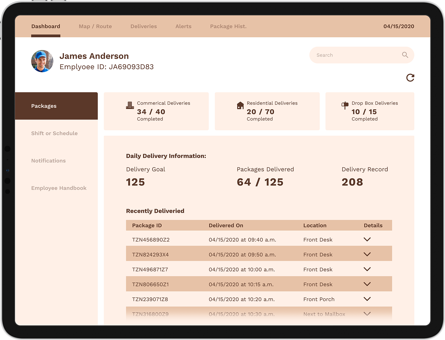
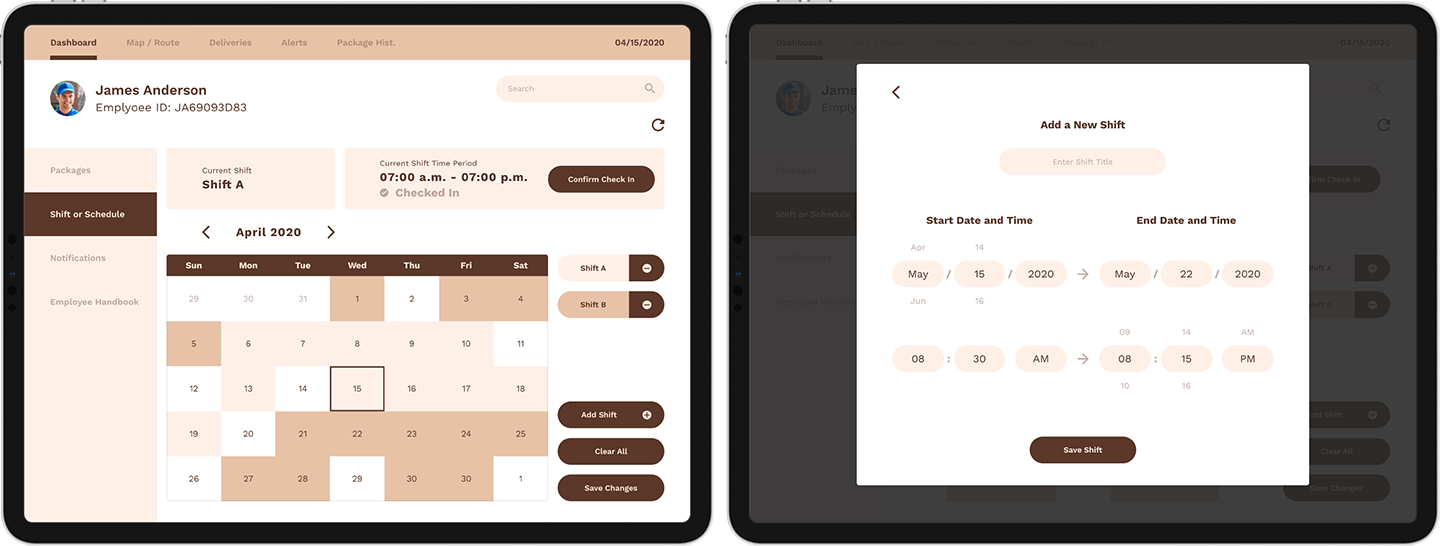
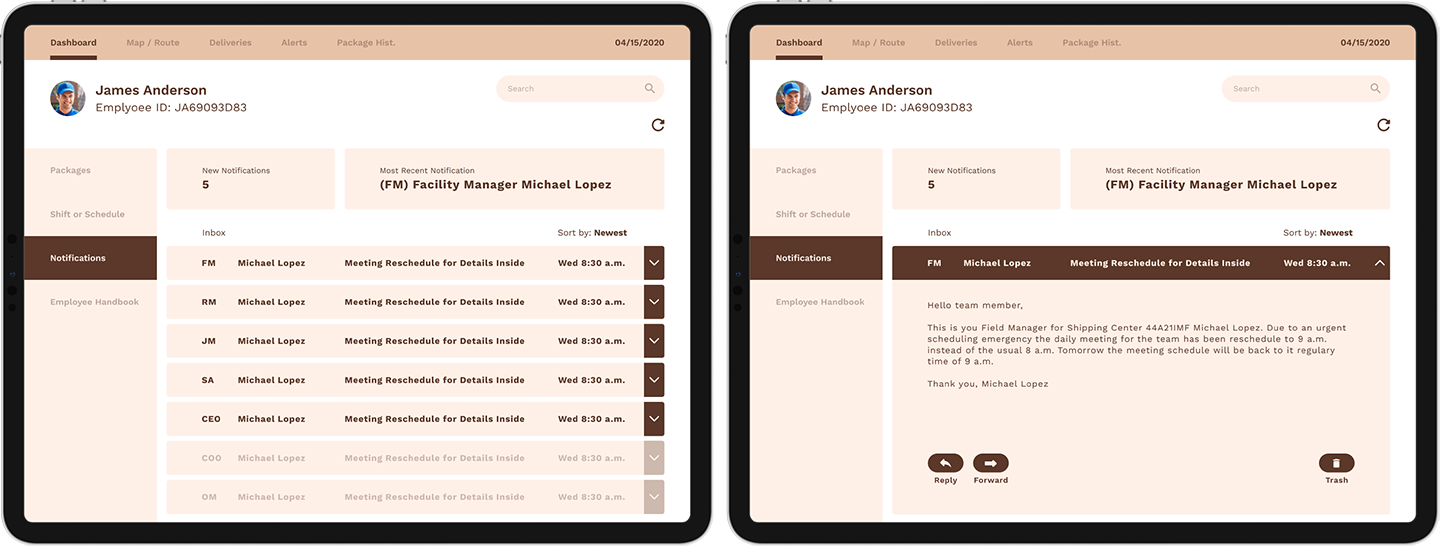
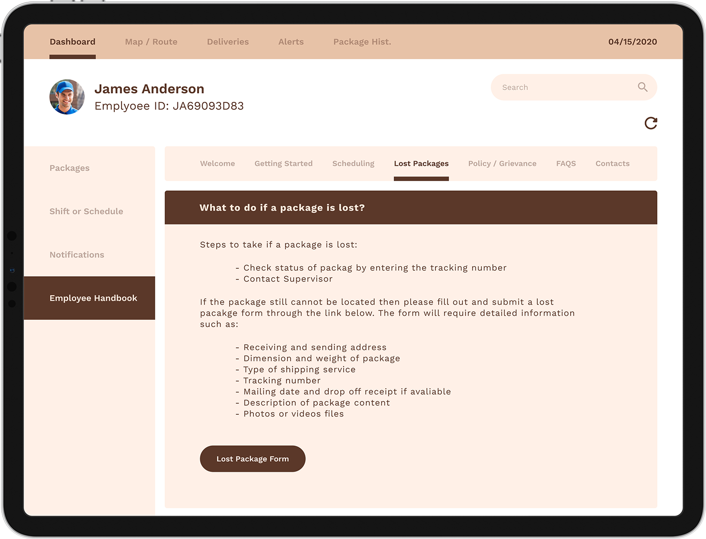
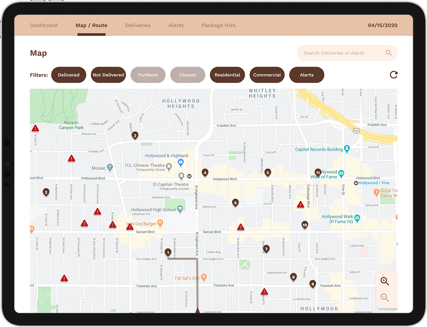
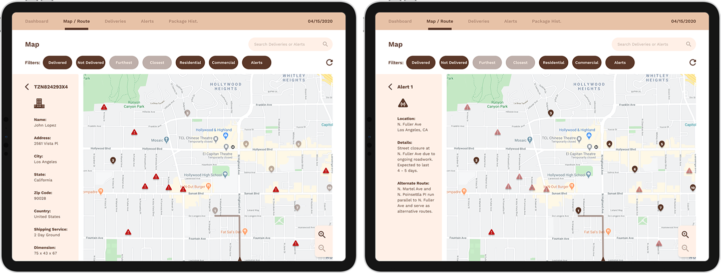
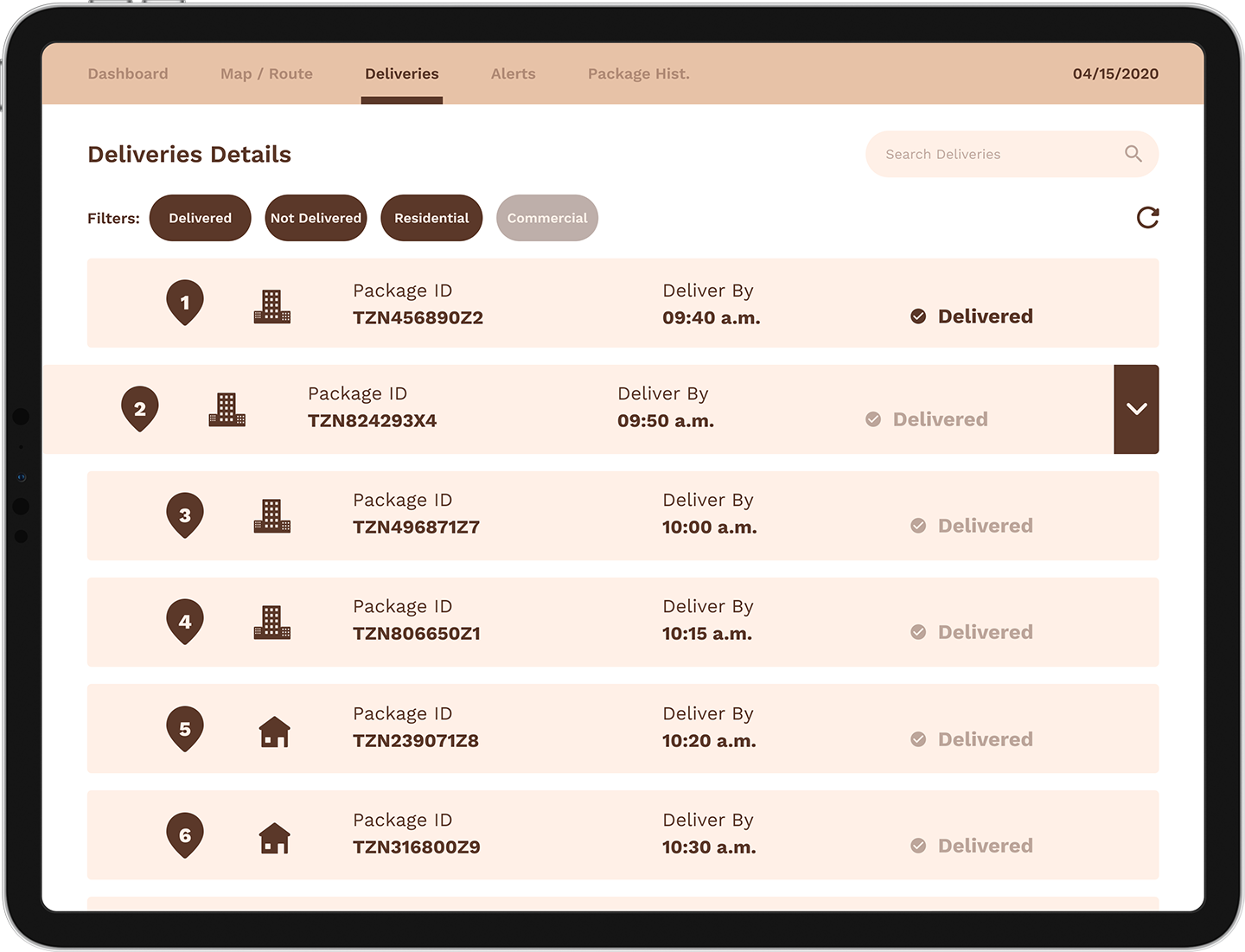
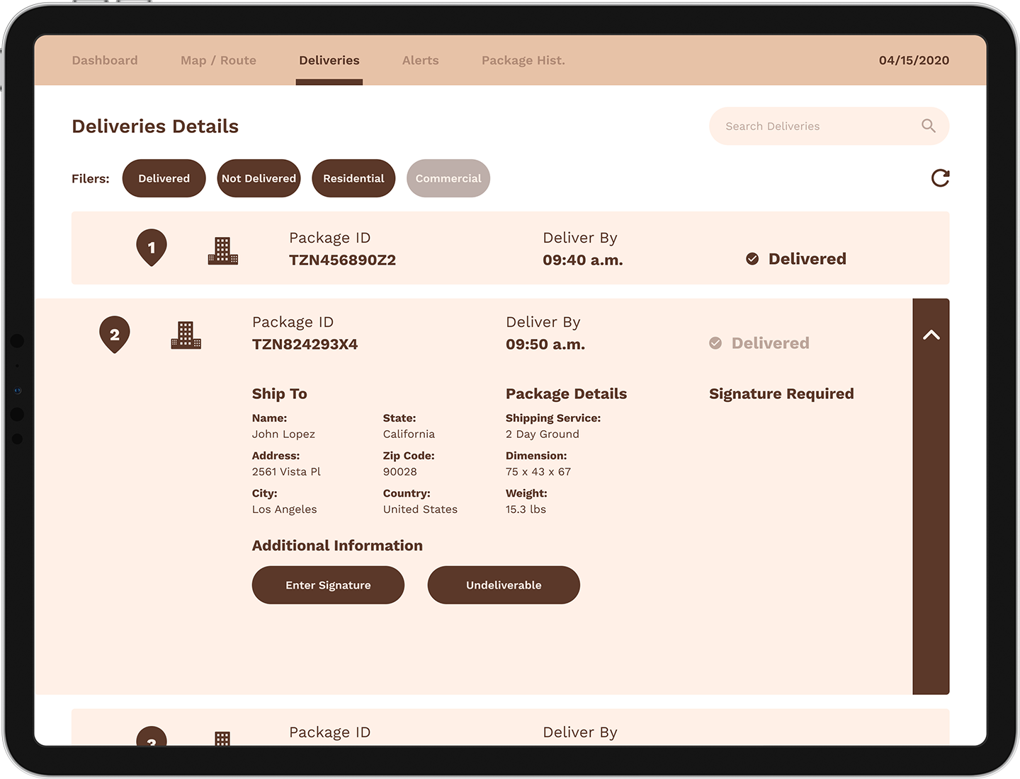
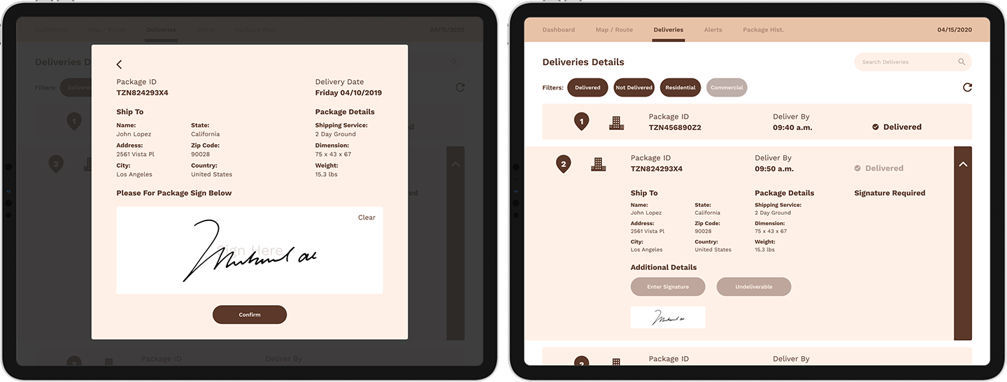
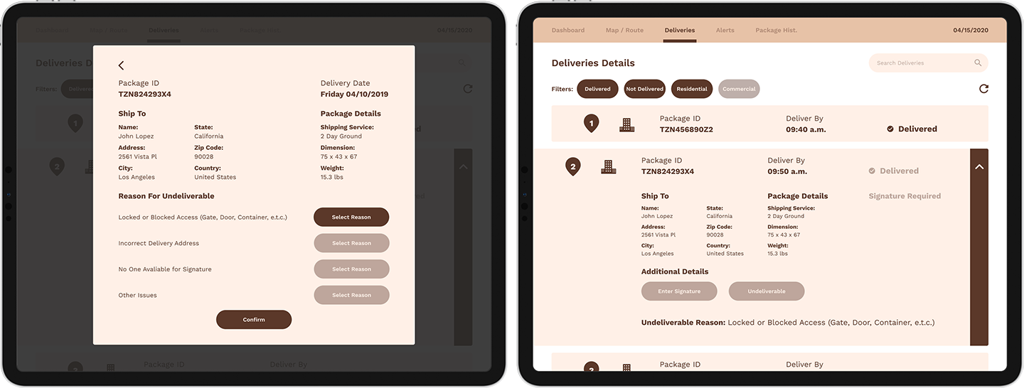
The problem is that in some logistic companies such as EPL there are multiple tool with UI that perform different processes such as scanning, signature and route layouts and we want to streamline these process by unifying them into one system so employee can accomplish their jobs faster and easier. Research is conducted by interviewing employees because they are the target audience and it's discovered that tools are broken up between an employee app on their company phone and a scanner device. Something we can do is create a UI that unifies the employee app and scanner device.We brainstorm to determine the pages that are needed and move onto creating wireframes which are rough layouts of the UI design that use simplified shapes to represent text, buttons, pictures and containers. A user journey or mind map is created that layouts which pages a user would go to accomplish certain task. The users of the UI begins at the dashboard which contains all the tools and information needed such as packages, shifts and schedules, notifications from management and an employee handbook. The users can navigate to other pages of the UI through the navigational options found on the top which includes maps/routes, deliveries made, alerts and package history.
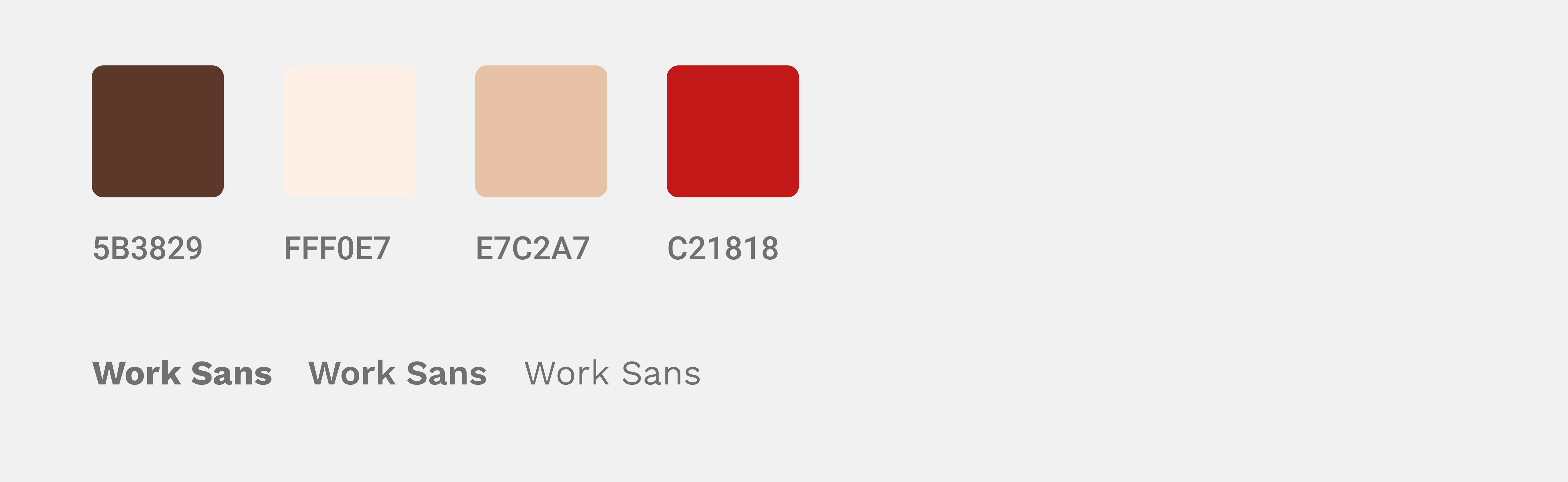
After the wireframe layout is finished it is reviewed and revised if necessary. Then the UI designer adds colors, shapes, images and fonts to create a visual prototype on Figma, Adobe XD or Sketch. This prototype goes through the same review and revision process.
The final step is to hand it off to a developer who creates a working version through coding. Once the design is functional it is and tested by a test audience. Revision are made and the design is launched. Feedback is given by employee that use the interface and revision are constantly made and applied through updates.
Outcome:
Overall the design is a success. It achieves the goal of creating a unified system for employees to perform multiple task without having to use multiple system that were previously in place such as scanners and employee phone app. The interface is also flexible enough that certain elements such as the tracking portion and claims portion can be tweaked in the future and released for customer to also use.


Designed and Coded by Richard Lim